

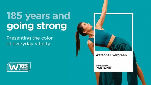
THE WHAT? Watsons has partnered with the Pantone Color Institute™ to launch Watsons Evergreen, a distinctive global brand colour designed to reinforce its identity and customer experience as part of AS Watson’s 185th anniversary celebrations.
THE DETAILS Watsons Evergreen is a blue-green colour developed in collaboration with Pantone to represent vitality, care and wellbeing across the retailer’s global operations. The initiative will be introduced across 16 markets in Asia, Europe and the Middle East, spanning store design, merchandising, digital platforms and Watsons’ own-brand products. The campaign will also include customer and community activations to celebrate the retailer’s 185-year heritage while creating a consistent visual identity across its international network. Watsons operates approximately 8,000 stores and more than 1,500 pharmacies across 16 markets as the flagship health and beauty retail brand of AS Watson Group.
THE WHY? The initiative highlights the growing strategic role of brand identity and customer experience in health and beauty retail. By creating a globally recognised visual asset, Watsons aims to strengthen brand consistency, support omnichannel engagement and reinforce customer loyalty across multiple international markets.
Source: AS Watsons
